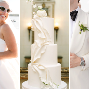
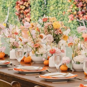
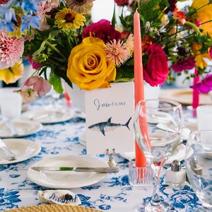
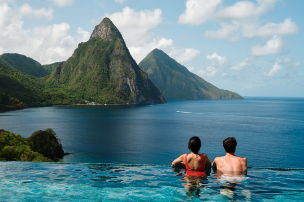
Pantone has released their top color picks for the spring season — their theme is "En Plein Air" ("in the open air"), and the soft, water hues are oh-so-refreshing! Get ready to see these colors everywhere in a few months.
Aquamarine
Pantone says: "Cool and calming, ethereal Aquamarine is a shade with a wet and watery feel. Open and expansive, this restful blue also acts as a stress reducer."
Make it work for your wedding: Choose aquamarine for your "something blue," or pair it with peach and green for a charming look.
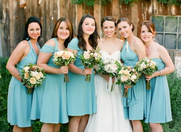
Photo Credit: Abby Jiu on Wedding Chicks via Lover.ly
Scuba Blue
Pantone says: "Scuba Blue conveys a sense of carefree playfulness. Scuba Blue offers a feeling of escape as it is reminiscent of a tropical ocean. This stirring and energizing shade takes us off to an exotic paradise that is pleasant and inviting, even if only a fantasy."
Make it work for your wedding: This vibrant shade is lovely with bright white and radiant orchid at a modern or beach wedding.
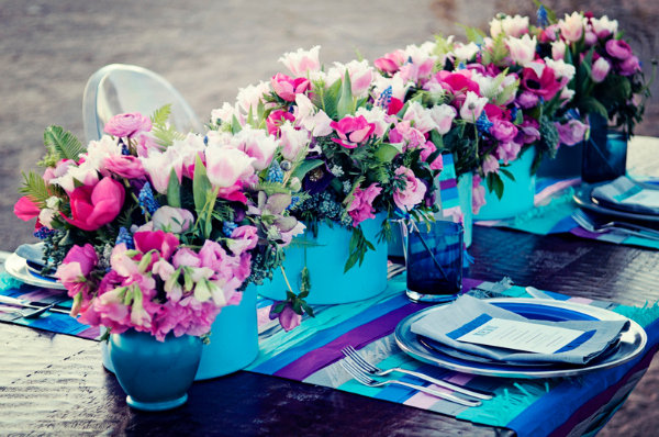
Photo Credit: Laura Ann Miller Photography on Every Last Detail via Lover.ly
Lucite Green
Pantone says: "Generally not thought of as a fashion color, though it does come back from time to time, Lucite Green is a soothing green shade whose time has really come again. Fresh and clarifying, cool and refreshing, Lucite Green has a minty glow. Light in weight and also in tone, Lucite Green seems almost transparent."
Make it work for your wedding: Get out your jadeite cake stands! This minty color is just made for a vintage-inspired wedding.
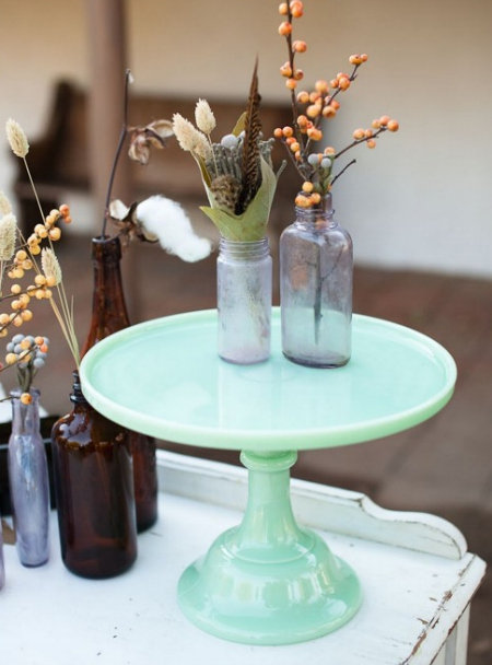
Photo Credit: Kaysha Weiner Photographer on Inspired By This via Lover.ly
Classic Blue
Pantone says: "Reliable and thoughtful, Classic Blue inspires calm, confidence and harmony. Serving as an anchor to the Spring/Summer 2015 palette, Classic Blue is a shade that is strong and reliable. Just as with the sea, because of its waterborne qualities, this Classic Blue is perceived as thoughtful and introspective.
Make it work for your wedding: Some colors are classic for a reason. This versatile blue will work just as well for a traditional wedding as it will for a quirky, modern affair.
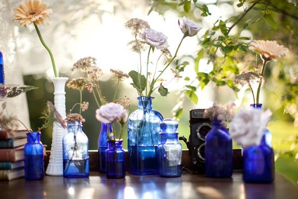
Photo Credit:: Sarah Ainsworth Photography on Wedding Chicks via Lover.ly
Toasted Almond
Pantone says: "Bringing balance to the coolness of the Spring/Summer 2015 color range is Toasted Almond. A sun-tanned neutral, Toasted Almond offers comforting warmth and is indicative of a spontaneous spring, summer feeling. Timeless and versatile, Toasted Almond is an organic shade that speaks to authenticity and all that is natural."
Make it work for your wedding: Pair it with metallics, creamy shades of white and ivory, and loads of touchable textures for a neutral look that's anything but boring.
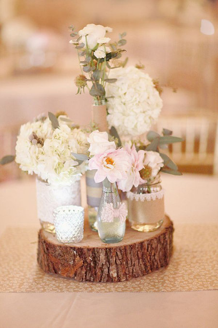
Photo Credit: Simply Bloom Photography, LLC on Wedding Chicks via Lover.ly
Strawberry Ice
Pantone says: "Strawberry Ice is suggestive of a cooling and refreshing delicacy, yet its warmth as a color is quite appealing. Subtle and charming, Strawberry Ice is an ideal shade for Spring/Summer 2015. Both tasty and tasteful, Strawberry Ice is a confection color that evokes a feeling of being “in the pink,” emitting a flattering and healthy glow."
Make it work for your wedding: This pretty pink is perfect for a spring bouquet.
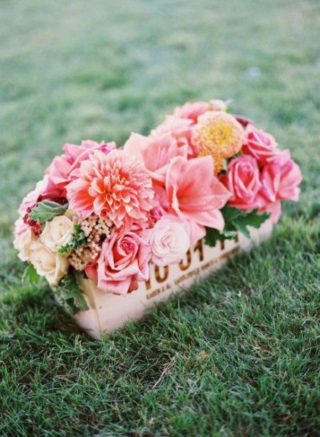
Photo Credit: Steve Steinhardt on Inspired By This via Lover.ly
Lavender Herb
Pantone says: "Lavender Herb is a shade rich in nostalgia. Lavender Herb is also a creative shade; one that will add a distinctive color pop whether worn on its own or combined with the other top Spring/Summer 2015 colors."
Make it work for your wedding: Incorporate lavender florals into your rustic wedding, or opt for vintage details in this beautiful color.
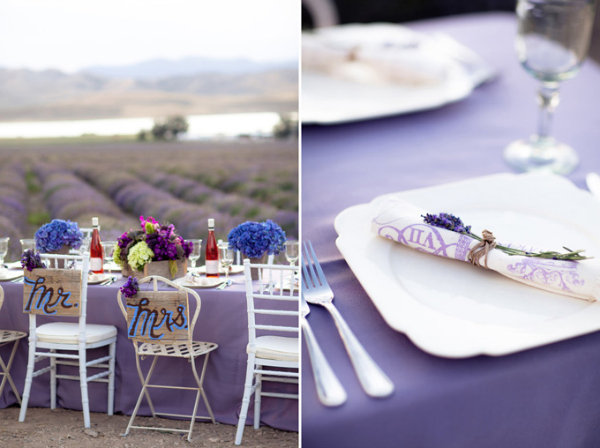
Photo Credit: Amy Lashelle on Glamour & Grace via Lover.ly
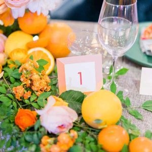
Tangerine
Pantone says: "Spontaneous and gregarious, Tangerine is a juicy orange shade that is energizing, yet not jarring to the eye. Good natured and friendly, but with a tangy edge, this fun-loving color invites a smile."
Make it work for your wedding: We love this fresh and perky color for spring bridal showers.
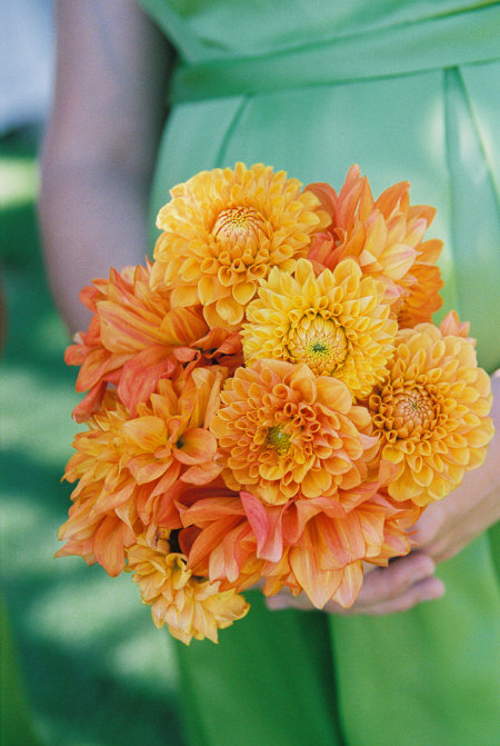
Photo Credit: Suzy Clement on Lover.ly
Custard
Pantone says: "Custard is a delicious and delectable yellow. Sweet and sunny, Custard is a cheering tone that brings thoughts of pleasant relaxation and comfort food."
Make it work for your wedding: We love the look of this quirky yellow hue with white and green accents at a brunch wedding.
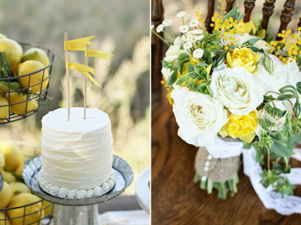
Photo Credit: Brooke Photo and Design on Grey Likes Weddings via Lover.ly
Marsala
Pantone says: "Sensual and bold, delicious Marsala is a daringly inviting tone that nurtures; exuding confidence and stability while feeding the body, mind and soul. Much like the fortified wine that gives Marsala its name, this robust shade incorporates the warmth and richness of a tastefully fulfilling meal, while its grounding red-brown roots point to a sophisticated, natural earthiness."
Make it work for your wedding: Pair this stylish shade with loads of pink and gray for an oh-so-romantic look.
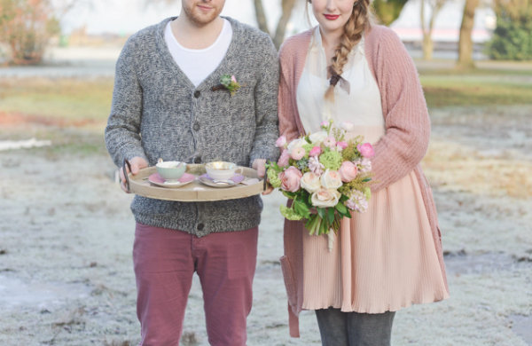
Photo Credit: Christie Graham Photography on Bridal Musings via Lover.ly
Glacier Gray
Pantone says: "More dominant for men than women in Spring/Summer 2015, Glacier Gray is an unobtrusive gray that contrasts and enhances; bouncing off other shades without taking away from them as it slips into the background to allow other colors to take center stage."
Make it work for your wedding: We expect to see a lot of groomsmen in Glacier Gray in 2015!
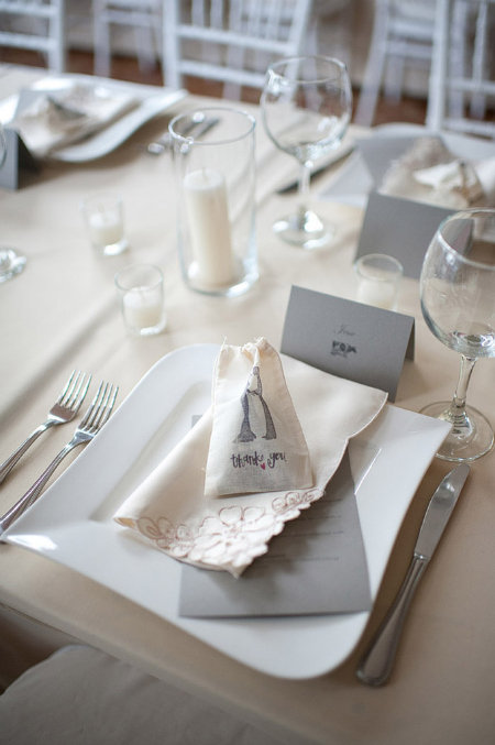
Photo Credit: Comfort Studio on Glamour & Grace via Lover.ly
Dusk Blue
Pantone says: "Reminiscent of the blue sky above, Dusk Blue is ultimately dependable and faithful. In a world that has become increasingly chaotic, the nostalgic Dusk Blue enables us to retreat into a safe place of quiet blue calm."
Make it work for your wedding: Since this color works well for ladies and gents, it's a great option for your bridal party.
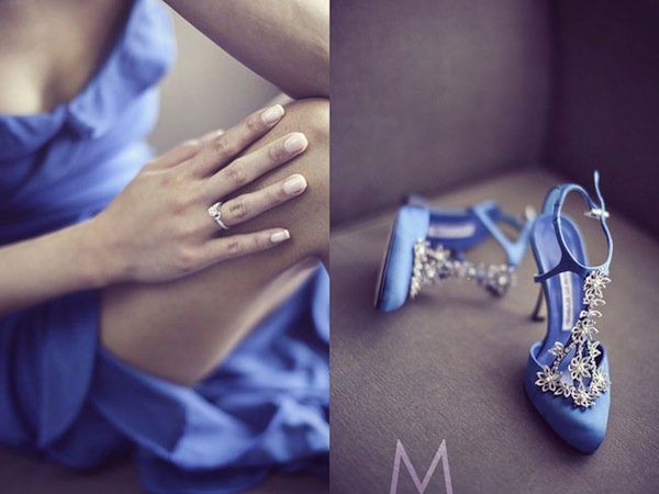
Photo Credit: Metrophoto on Bride and Breakfast via Lover.ly
Treetop
Pantone says: "Speaking to restoration and new beginnings, Treetop is a natural and fertile green. Ideal when used as a background to other shades, Treetop is a healthy harmonious green from nature which offers a reassuring presence."
Make it work for your wedding: Pair lush green florals with organic touches for a sophisticated and modern look.
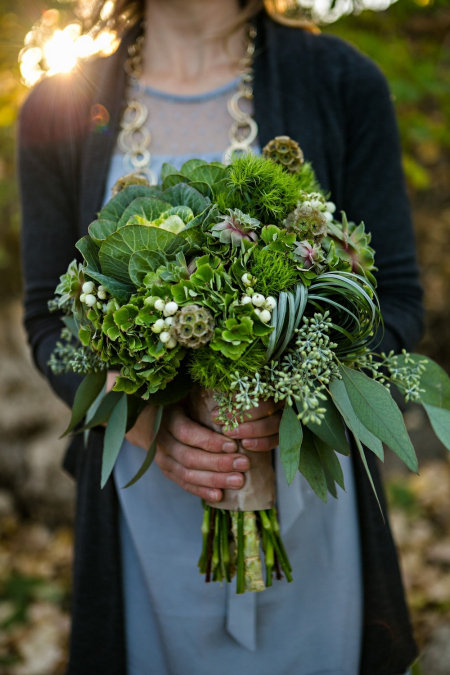
Photo Credit: Moore Photography on Academy Florist via Lover.ly
Woodbine
Pantone says: "Woodbine, is a tropical green that could best be described as nature’s neutral. A classic yellow-green that could be used with anything and everything, Woodbine is a hue of foliage, grass, and growing plants."
Make it work for your wedding: Ask your florist to incorporate hints of Woodbine into your arrangements.
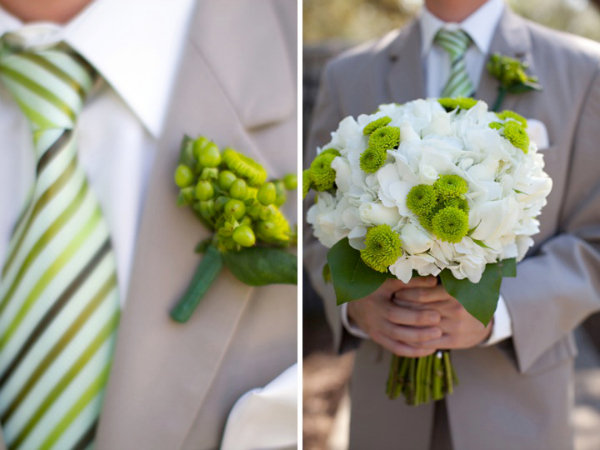
Photo Credit: Kylene on Every Last Detail via Lover.ly
Sandstone
Pantone says: "Rugged and woodsy, Sandstone is a complex neutral that has a warming presence. Earthy and real, Sandstone provides us with a return to nature and what is beautiful, simple and memorable."
Make it work for your wedding: Incorporate this color into a 70s-inspired desert wedding for loads of boho flair.
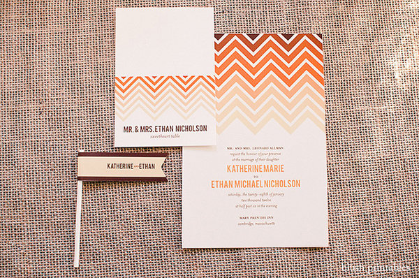
Photo Credit: Henry photographers on Heart Love Always via Lover.ly
Titanium
Pantone says: "Strong, masculine, and solid, Titanium is a gray shade that speaks to timelessness. Classic and tasteful, there is an implied quality attached to anything so long lasting. Durable and practical, this basic gray shade has classic appeal."
Make it work for your wedding: This color may feel masculine, but you can easily add a feminine touch by pairing it with soft shades of pink and lavender.
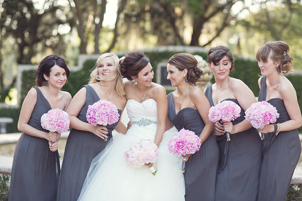
Photo Credit: Vitalic Photo on Southern Weddings via Lover.ly
Which of the Spring 2015 colors is your favorite?
—Rachel W. Miller
 This post originally appeared on Loverly, the heart of weddings: a visual inspiration search engine designed to help brides discover ideas, people to hire, and things to buy. Loverly makes finding beautiful wedding inspiration easier than ever! Their images are powered by the best wedding publishers and wedding shopping partners on the web. Find Bridal Guide on Loverly >>
- Anonymous's blog
- Log in or register to post comments
